
A mahjong color matching service is most useful when it turns “make it like this” into a physical approval that production and inspection can repeat. Screens, photographs, resin thickness, texture, and lighting all influence what a buyer sees, so the process needs evidence at each handoff.
The screenshot looked perfect
The buyer chose a deep green from a presentation. The factory opened the file on another display. A phone photograph of the first sample looked too blue, while the physical piece looked acceptable near a window and dull under warm office light. Nobody was being careless; the reference was doing too many jobs.
This is why color work should start by naming the object, surface, lighting, and approval method. A number, chip, render, and physical sample are different forms of evidence. They should not be treated as interchangeable.
Step 1: describe the color location
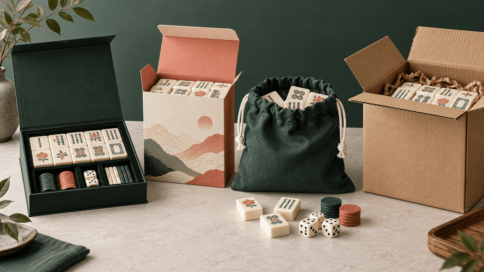
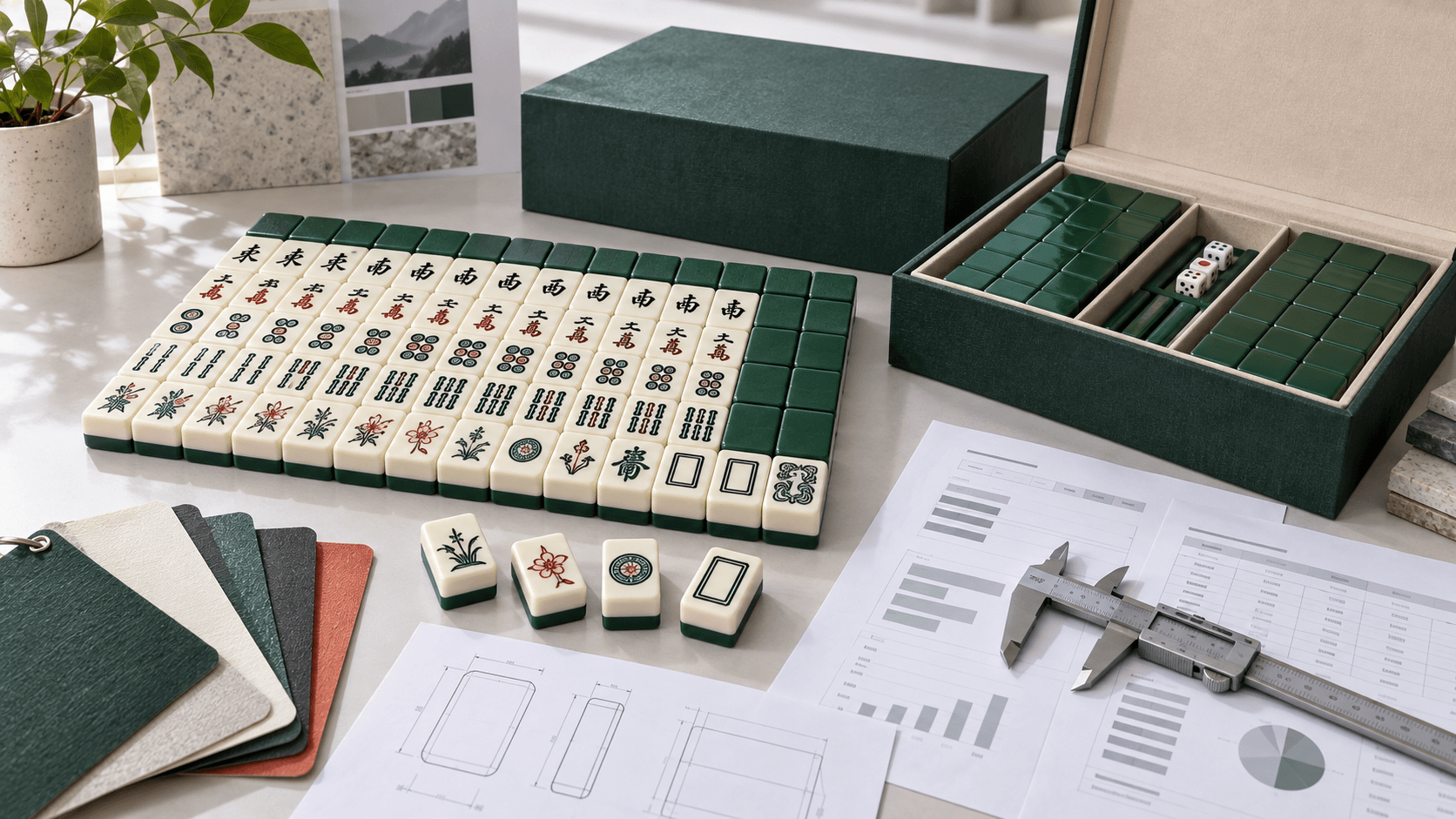
List every colored surface separately: tile body, back layer, engraved fill, printed face, rack, pusher, mat, case, insert, retail box, and label. Note material, transparency, thickness, finish, and surrounding colors. The same nominal red can appear different on opaque paper, polished acrylic, recessed paint, and fabric.
Mark which surfaces must coordinate and which must match closely. A brand mark may need tighter visual control than an interior tray that is hidden during use. This keeps effort aligned with the customer promise.
Step 2: choose the reference hierarchy
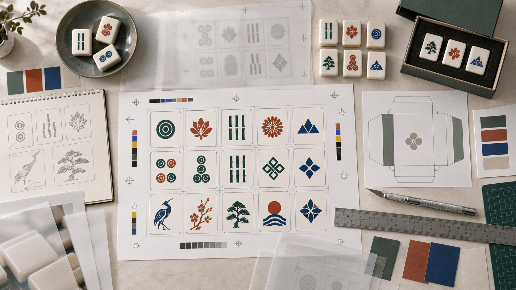
Put references in order of authority. A physical approved tile may control the body color, a printed proof may control the carton, and a digital file may control the artwork values. If two references disagree, the hierarchy tells the team which one wins.
| Reference | What it can control | Limit to record |
|---|---|---|
| Physical production sample | Combined material, thickness, finish, and process appearance | Can age, scratch, or be lost |
| Color system chip | A shared target under stated viewing conditions | May not predict transparent or textured material |
| Printed contract proof | Packaging and printed artwork relationship | Depends on substrate, ink, and finishing |
| Instrument reading | Measured comparison under defined settings | Does not replace visual fitness for purpose |
| Digital file or render | Artwork intent and communication | Display and export conditions vary |
Step 3: agree on viewing conditions
Review samples in the same neutral area when possible. Name the light source or viewing setup, background, orientation, and observation distance. Also inspect the product in the real use environment, because a technically close sample can still fail the intended shelf or table experience.
Do not approve from one compressed photo. Photographs are useful records of arrangement and defects, but camera processing, white balance, exposure, and the viewer's screen can shift the result.
Step 4: separate color from finish
Gloss, polish, frosting, texture, engraving, metallic effects, glitter, and transparent layers change perceived lightness and saturation. Approve the intended finish with the color whenever appearance depends on both. A flat plaque made from another thickness may answer a material question but not the final visual question.
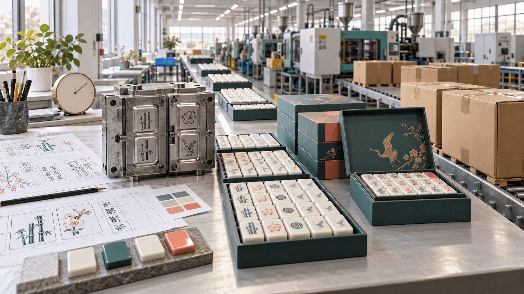
For a layered tile, identify which layer carries color and what sits behind it. For engraved fill, check depth, fill coverage, wiping, and the contrast after normal handling. For printing, include the densest and finest faces in the sample.
Use mahjong color matching service checkpoints
A controlled sequence prevents an early reference from being mistaken for production approval. The exact number of samples depends on the project, but each checkpoint should have one stated purpose.
| Checkpoint | Decision | Record | Do not assume |
|---|---|---|---|
| Reference review | Is the target usable and rights-cleared? | Reference ID and hierarchy | That a screen value predicts the material |
| Material sample | Does substrate and thickness support the direction? | Material, process, date, lighting | That decoration will look identical |
| Decorated sample | Do face, back, fill, and finish work together? | Face IDs and revision comments | That a single piece proves lot consistency |
| Pre-production approval | Is the production route released? | Signed sample ID and allowed range | That later substitutions are acceptable |
| Lot comparison | Does production stay within the agreed visual range? | Sample selection and disposition | That every position in a carton is identical |
Measurement can support the conversation
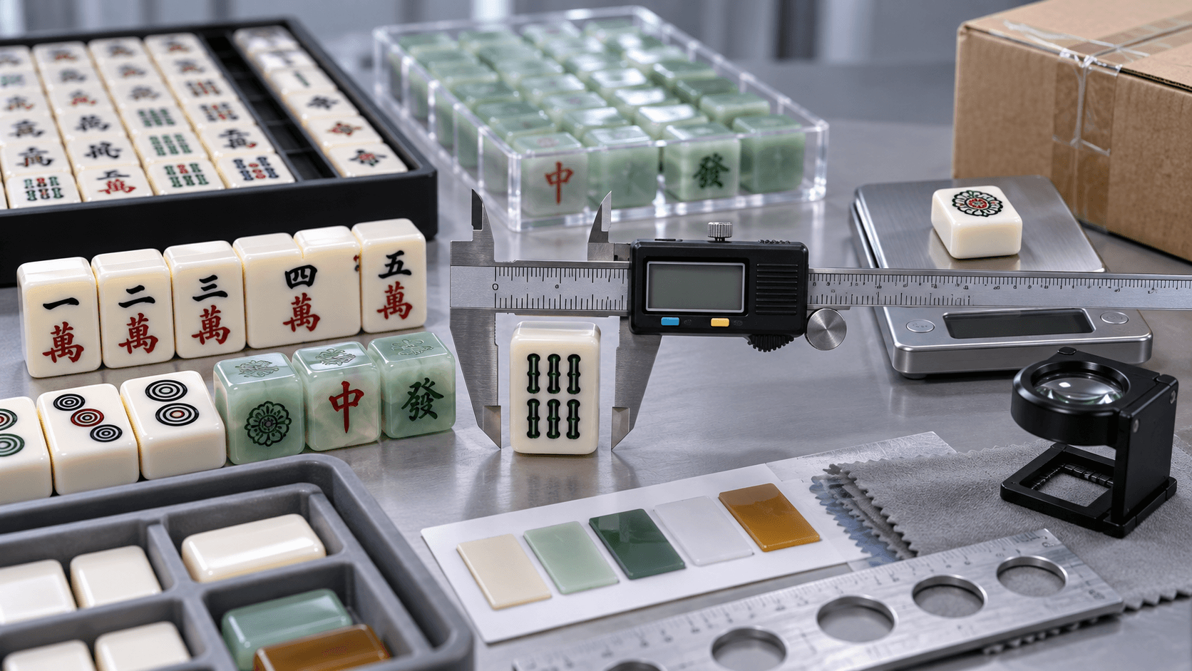
Instrumental color data can make comparisons more reproducible when the parties agree on the instrument, geometry, illuminant, observer, sample preparation, and calculation. ISO/CIE 11664-4 specifies calculation of coordinates in the CIE 1976 L*a*b* color space and methods for color differences. Buyers can review the ISO/CIE 11664-4 overview with qualified color professionals.
A delta value is not a universal acceptance rule for every Mahjong surface. Transparent, glittered, textured, small, or multi-colored features may need a tailored visual and instrumental method. The specification should state what is measured and what still requires a human approval.
Approve a range, not a lucky piece
Ask to see multiple pieces from the relevant sample or trial. Spread them rather than stacking them, and compare the most different examples. If the product uses several related colors, review the palette together because a small shift may matter more beside its neighbor.
Record the acceptable visual range with boundary samples when appropriate. One perfect center sample does not explain how much normal variation the brand will accept.
Diagnose the symptom before changing the formula
A sample may look too dark because the material is thicker, the surface is glossier, the background changed, the fill is deeper, or the photograph was underexposed. Changing pigment before identifying the cause can create a second problem.
- Too dull: compare finish, surface haze, and lighting before changing hue
- Too blue or yellow: compare light source and surrounding neutral background
- Faces lack contrast: review symbol color, line weight, depth, and substrate together
- Pieces vary within a set: investigate material batch, process sequence, and inspection spread
- Reorder differs: compare retained standards, production records, and approved changes
Protect the palette across different materials
Coordinated does not always mean numerically identical. A printed carton, acrylic tile, fabric mat, and molded rack reflect or transmit light differently. Set a visual relationship for the complete product, then define the best control for each material and process.
Review packaging near the product. A saturated box can make a subtle tile appear washed out, while a colored insert can influence a transparent piece. The physical unboxing arrangement is part of color approval.
Keep a production color record
Archive the approved physical reference, photographs, material and finish, formula or process identifier where appropriate, instrument settings if used, date, supplier, and production lot. Label retained samples so a reorder team can find the correct standard.
Require a new review when a material, thickness, tool surface, ink, paint, coating, supplier, or production location changes in a way that may affect appearance. A familiar color name is not enough to authorize a process change.
Prepare a focused color brief
Send the target market, full palette, material direction, transparency, finish, artwork, coordinated accessories, packaging, quantity, and launch timing. State which reference is authoritative and what physical samples already exist. Include concerns such as metamerism, brand color importance, or a need to match a previous lot.
ABC Mahjong supports custom colors, artwork, molds, packaging, and matching accessories through its custom Mahjong program. Review the product categories to identify every material and surface that belongs in the color plan.
FAQ
Can a factory match color from a phone photo?
A photo can communicate direction, but it is a weak production standard. Provide a physical or controlled reference and agree on how the sample will be viewed.
Is a color code enough for acrylic?
It is a useful starting point, but material transparency, thickness, finish, and production process affect appearance. Approve a physical sample made in the intended construction.
Why does the sample look different indoors?
Different light sources and surroundings change perception. Record the primary viewing condition and check the real use environment before release.
Should color and artwork be approved together?
At least one decorated sample should show the relationship. Background color, line weight, fill, print, and finish all influence legibility.
What is a golden color sample?
It is an identified physical reference used for comparison. Its material, finish, revision, date, storage, and approval scope should be recorded.
How many pieces should buyers review?
Review enough pieces to see meaningful variation for the process and risk. A single selected piece cannot demonstrate the range of a production lot.
Can color difference be controlled only by an instrument?
Not always. Measurement can support repeatability, while visual review confirms whether the complete product meets its intended appearance and use.
How should retained samples be stored?
Protect them from light, heat, moisture, scratches, contamination, and label loss. Replace or revalidate a reference that has visibly changed.
Does a color change affect price or timing?
It may affect material purchasing, setup, sample rounds, SKU count, waste, or packaging. Ask for the commercial impact before releasing the change.
What should buyers send for a color review?
Send reference hierarchy, physical samples if available, material and finish, artwork, quantity, related components, destination, and approval deadline.
Make color approval repeatable
ABC Mahjong works with B2B buyers on colored acrylic tiles, coordinated racks and pushers, mats, cases, packaging, and private-label collections. Read about the manufacturing scope and send the palette through the contact page. A practical mahjong color matching service replaces uncertain visual messages with a sample and record both sides can use.